Branding
Match the chat widget to your site. Color, header text, opening message, AI persona — all live in Settings → General and update instantly on every page your snippet is installed on.
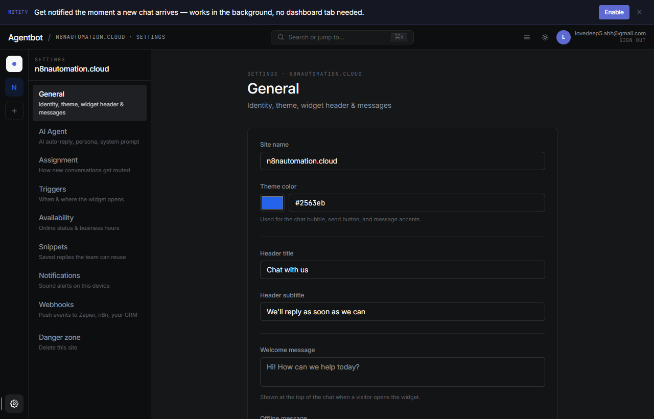
The fields
Theme color
The accent color used for the chat bubble, header bar, and your agent message bubbles. Pick something that contrasts with white text — a medium-saturation primary brand color works best. Pure light yellows and pastels are hard to read.
Header title
The title at the top of the chat panel. Defaults to “Chat with us”. Try something on-brand: “Talk to Bloom”, “Stoneware Support”, “Hi 👋”. Keep it short.
Header subtitle
One-line under the title. Defaults to “We'll reply as soon as we can”. Set expectations: “Reply in minutes during business hours”, “Powered by AI — humans nearby”, etc.
Welcome message
The first message a visitor sees when they open an empty chat. It's an AI-style bubble, not a real reply — but it sets the tone. Example: “Hi! What brings you to our site today?”
Offline message
Shown in the chat when your availability mode currently reads as Offline. Use it to manage expectations: “We're away until 9am — leave a message and we'll reply first thing.”
AI persona name
The name the AI agent uses for itself when replying. Defaults to Aria. Visitors see this name next to AI messages. Pick something friendly and on-brand. Examples: “Max”, “Coral”, “Bloomi”, “Beta”.
Agent display name & avatar
Each teammate has their own display name and avatar — these show up next to their messages, separately from the AI persona. Set yours under Profile → Edit profile in the dashboard.
- Upload a square headshot. PNG or JPG, max 5MB.
- Set a display name — visitors see this, not your email.
When no avatar is set, the widget uses a colored initial circle based on the display name. Looks clean either way.
Powered by Agentbot
The widget shows a small “Powered by Agentbot” line at the bottom of the chat. On a future paid tier you'll be able to remove or replace this — for now it stays on for all sites.