Widget triggers
Triggers decide where the chat widget shows, how it starts (open or closed), and whether it pops itself open after a visitor has been on the page for a while.
Find it
Dashboard → Settings → Triggers.
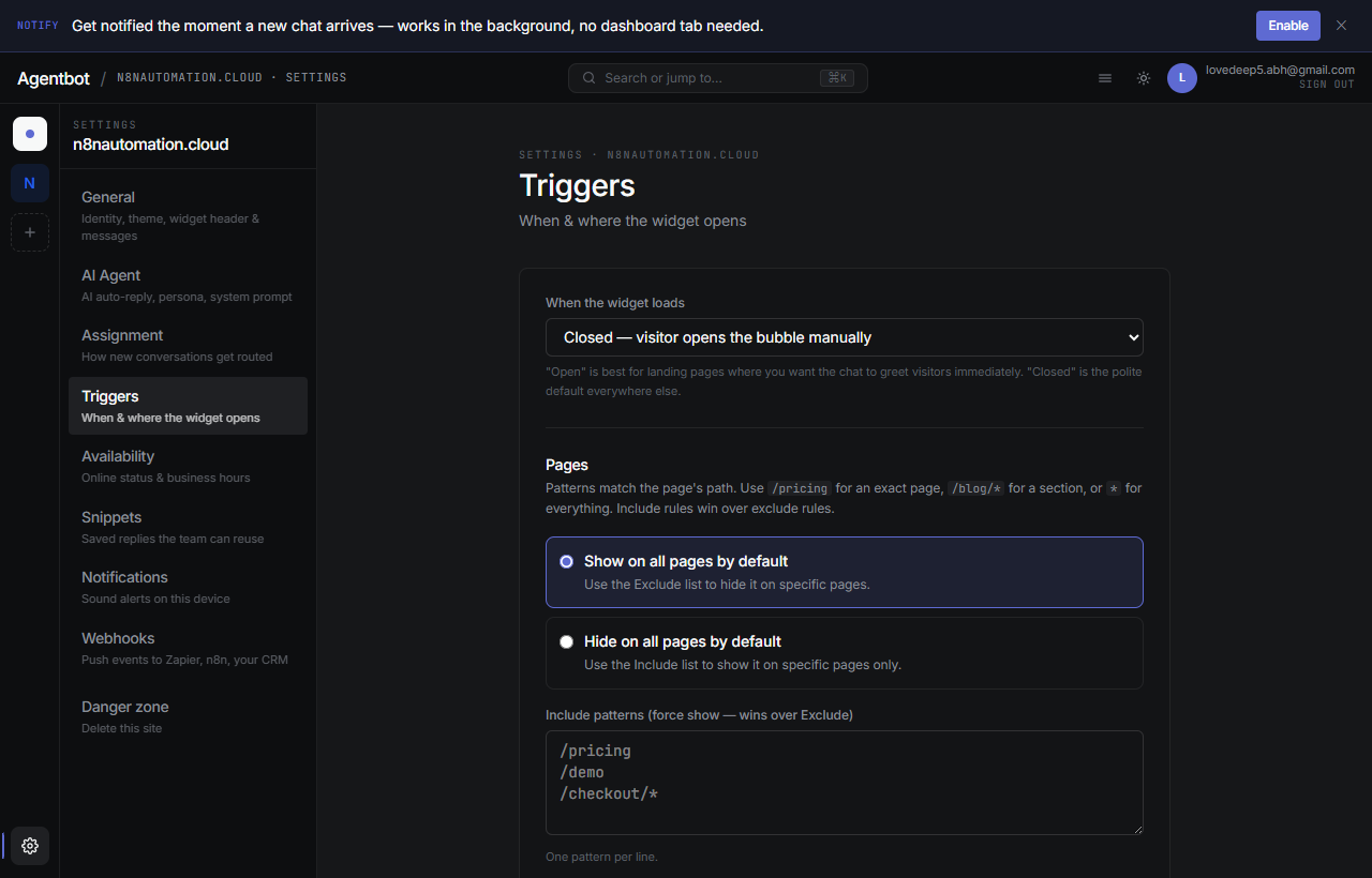
1. Default state
How the widget appears the first time a visitor loads the page:
- Closed (bubble) — Default. Just a chat bubble in the corner, opens when clicked.
- Open — The chat panel opens automatically. Great for high-intent pages like pricing.
- Hidden — Widget doesn't render at all. Useful when combined with page targeting to hide it on certain pages.
2. Page targeting
Decide which pages on your site the widget should appear on. You set a default (show or hide on all pages) and then optionally add include/exclude patterns to override that default.
Patterns
Patterns match against the page's URL path. Wildcards are supported:
| Pattern | Matches |
|---|---|
/pricing | Just /pricing exactly |
/blog/* | Any path starting with /blog/ |
/checkout* | /checkout, /checkout/step1, etc. |
* | Everything |
Common setups
Show on all pages except checkout:
- Default: Show
- Exclude:
/checkout*
Only show on pricing and contact pages:
- Default: Hide
- Include:
/pricing,/contact
3. Auto-open
Auto-open is “tap on the shoulder” behavior — the widget pops itself open after the visitor has shown interest. It's off by default.
Trigger conditions
- Scroll percent — open when the visitor has scrolled past X% of the page (e.g. 60% — they've read most of the content).
- Welcome message — show a short proactive message instead of just opening empty (“Hi! Anything I can help you find?”).
- Frequency — Once per session, once per day, or every time. Be conservative — annoyance kills conversion.
Mobile vs. desktop
Triggers apply to both. On mobile, “open” just means the full chat panel slides up — there's no separate small/large state.